
There are few companies more famous for their modern design principles than Apple. For decades, Apple has created user-friendly products that are clean, simple, and high-quality. Steve Jobs said about design, “It’s not just what it looks like and feels like. Design is how it works.”
At Apple, that meant taking a human-centered approach to design thinking — putting the user’s needs first when designing products.
Perhaps not so coincidentally, they also became the first US company to reach a $3 trillion market cap.
But Apple’s products — from the iMac to the iPhone 14 — are far from the only great examples of human-centered design. Plenty of successful organizations have applied human-centered design principles to understand and eventually meet their users’ needs with helpful solutions and products.
Let’s dive into some examples for inspiration.
The principles of human-centered design
Human-centered design is a framework for creative problem-solving that focuses on understanding the needs, wants, and limitations of the people who will most directly benefit from the solution.
The goal of human-centered design is to create solutions that are not only functional, but also enjoyable for individuals. By focusing on people’s needs, experiences, and behaviors, it helps to create products that are intuitive, efficient, and easy to use.
Understanding end-user needs is especially important during times of turbulence and fluctuation in the market, such as when the pandemic first began back in 2020. During those times, customer needs and priorities were shifting, and they might have required something new from your product to solve their problems.
A human-centered approach helps you stay focused on those shifts as you iterate and define new directions for your product.
You typically apply HCD in three main phases:
- Looking
- Understanding
- Making
The key is to empathize and center your users’ pain points to create a solution for them and then learn more about how they feel about your product and its reception. Instead of forcing your ideas through, stay open to and implement feedback from your audience along the way.
Ask yourself these 7 questions to build empathy throughout the design-thinking process
1. Netflix
Netflix first encapsulated the meaning behind HCD when it started out as a mail-order DVD service at a time when people were first starting to turn away from brick-and-mortar stores in favor of eCommerce. It would only get better at anticipating user needs from there to become the streaming giant that it is today.
Why does its human-centered design approach work so well?
- Completely changed — and catered to — viewing habits with binge watching: When Netflix’s streaming service first launched, it wasn’t a totally revolutionary service since video on demand already existed. But it was the first company to revolutionize binge watching with full-season episode drops. No more waiting until next week. Users could watch episode after episode of a new show to their heart’s content.
- Incorporated predictive analytics and data: The “Because you watched” feature was another clear winner. Netflix’s algorithm gathers unique user data and then predicts which shows and movies viewers will want to watch next, recommending new titles to its users.
- Implemented features for a better watching experience: Other helpful features like continuous episode looping and the “Skip Intro” button help create a seamless watching experience for viewers. Netflix already offers an ad-free experience, but these features ensure there are minimal interruptions or repetition if you’re watching multiple episodes at a time.
Netflix’s design approach shows how carefully it thought about the viewer’s experience first and foremost and took steps to simplify and streamline the act of watching TV every day. It understands what users want out of the platform — personalized streaming options and no interruptions — and its features reflect that.
Try it out with a walk-a-mile immersion exercise
The Walk-A-Mile Immersion template helps build empathy with users so that your proposed solutions address their wants and needs from an informed perspective. Understand what habits people may have, what they experience during a specific journey, and what problems they may face.

2. Spotify
Way back in the day, if you wanted to listen to music from different artists and albums, you’d have to burn a CD with all of your favorite tracks. Then the iPod came along, and you could purchase songs individually from iTunes or Napster. But Spotify realized that what any music lover really wanted was unfettered access to the whole wide world of records, soundtracks, and show tunes. And that’s what it provided.
Why does its human-centered design approach work so well?
- Offered uninterrupted listening and access: Spotify made music completely accessible all through one app for one monthly fee. It recognized that music listeners had to import songs from multiple places or pay for individual songs and built a central platform instead. Nowadays, Premium users can enjoy their app with features like no ads and unlimited skips, so they can stream music without interruption.
- Worked through product pain points to increase access: It had to work through user feedback and pain points around the Spotify platform to gain access to more popular artists since it didn’t initially have access to their music. Artists like The Beatles, Taylor Swift, and Coldplay all either pulled music or didn’t allow their catalog to be streamed. Spotify understood this was a sticking point for users and worked to resolve those issues.
- Curated a personalized listening experience: Every year, Spotify releases “Spotify Wrapped” for each user — a statistical rollup that breaks down their musical tastes, listening habits, where they rank among their favorite artists’ listeners, and more.
Spotify not only realized what was missing from the market to deliver a solution for users — it has also iterated on ways to make listening to music more personal and entertaining.
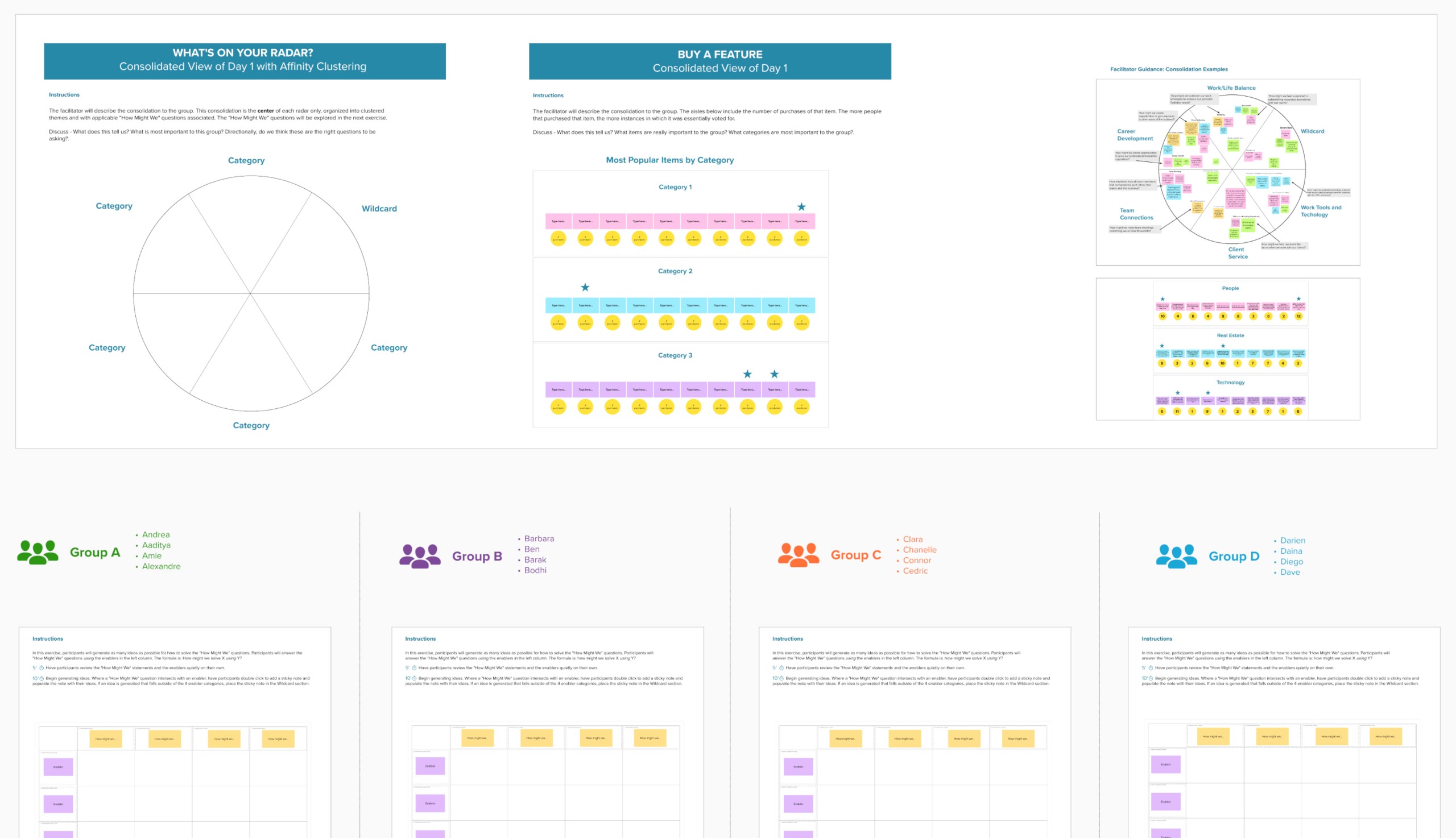
Try it out with a bulls-eye diagram
A bull’s eye diagram helps you understand what considerations are most important to people. Use the bull’s-eye to identify which features, solutions, or ideas are most important to your users and let that guide your decision-making.

3. Airbnb
From the beginning, Airbnb intentionally kept a human-centered focus to its brand. It wanted to design a more comfortable, tailored experience than the typical stock experience on offer at hotel chains. So it focused on cultivating a home away from home for its users — each unique yet authentic — that allowed visitors to immerse themselves in the community and culture.
Why does its human-centered design approach work so well?
- Empathized with its users’ experiences while traveling: The founders first realized that there was a need for alternative stays, especially for more budget-conscious travelers. These users still wanted comfort and to experience the local community, and there was a clear gap in the hospitality market for them.
- Invested in UX to connect users with great stays: Since it first launched, Airbnb has invested heavily in the app’s UX and design to make sure that users can find the best stay, depending on their unique needs and requirements. It has emphasized colorful photography, detailed amenity listings, specific search filters, and price parameters to help users find the perfect stay.
- Continuously iterated to serve people’s needs: After the start of the pandemic, it emphasized flexibility on stays and pivoted to remote workers post-pandemic to respond to user feedback during a period of high fluctuation. It has also rolled out features like Experiences to help connect travelers with things to do while on vacation, not just places to stay.
From the beginning, Airbnb’s product was built out of a need to serve humans who wanted a different way to travel. Over time, it has continued to incorporate user feedback to build a more helpful app that serves its audience.
Try it out with an experience diagram
The experience diagramming exercise can help you understand key touchpoints, different people your subjects interact with, and visualize their experience by helping you map and consider the impact of every element along the way.

4. Slack
Most people don’t get very excited about using work software or tools — a major difference from consumer social products, which are usually described as fun and engaging. Slack figured this out when it conducted a survey and decided to launch a collaboration platform to make work less boring, more pleasant, and more enjoyable.
Why does its human-centered design approach work so well?
- Put human connection at the heart of its app: Slack’s designers have heard often from users that they’re concerned about missing social cues or misinterpreting messages in written communications. So it has prioritized building human cues and connections inherently into its platform, such as through the use of emojis, status updates, and community channels.
- Focused on simplifying work tasks: Slack has intentionally designed features to not only make it easier to collaborate but also to make it more enjoyable and delightful to be at work. With public channels and threads, coworkers can share projects and updates all in one place.
Slack’s team realized how frustrating it is for people to constantly chase down answers and feedback and simplified those workflows. In the process, it created an app where people enjoy spending their time, checking in with coworkers and fostering connections they might be missing at their workplace.
Try it out with the interviewing template
The Mural Interviewing template can help you conduct ethnographic interviews to build relationships with your subject and understand what they experience, feel, think, and understand.

Apply human-centered design best practices with your own team
While humans should be at the center of the product you’re designing, they should also be at the center of the process as it’s happening. Collaboration between your team members is essential to create a thoughtful product design that meets user needs. The co-designing method can help you keep that focus all the way throughout the process, and Mural and LUMA Institute are there for you to put it into practice.
Start understanding your customer’s needs and pain points by running a design-thinking workshop. Mural’s template will get you off the ground, empathizing and understanding your customers, and collaborating with your team to start building solutions.
Try the Design Thinking Workshop template
Use this Design Thinking Workshop template to plan and facilitate a multi-day design thinking workshop that guides collaborators through understanding the challenge at hand and ideating to create innovative solution concepts for review and prioritization.
Try putting these examples and templates to use with Mural and the LUMA system. With this combination of a powerful collaboration space and guided methods, your teams will be equipped to tackle complex challenges, imagine new possibilities, and keep people at the center of their design processes.
About the authors
About the authors

Tagged Topics
.jpg)


%20(3).jpg)
%20(1).jpg)
%20(1).jpg)